Overview
Senior living is often perceived solely through the lens of "healthcare."
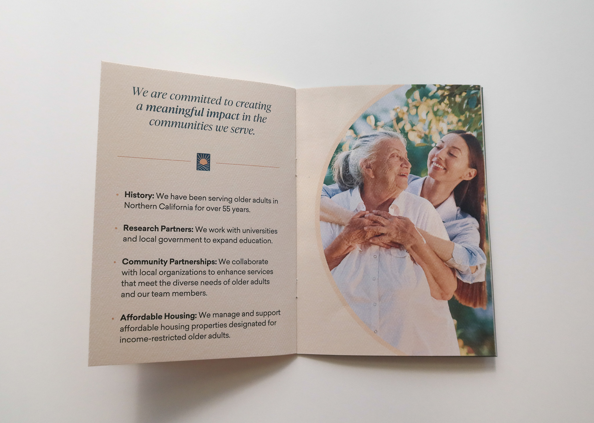
However, Eskaton, a Northern California nonprofit serving older adults for over 50 years, embodies a different vision. Eskaton means "dawning of a new day," which is reflected in their commitment to evolving their healthcare model into retirement hospitality, adjusting to the needs of the market.
This shift cultivates communities where residents feel a strong sense of belonging and have opportunities to discover new passions or rekindle existing talents. As Eskaton embraces this new model, their marketing and branding require a corresponding transformation.
Solution
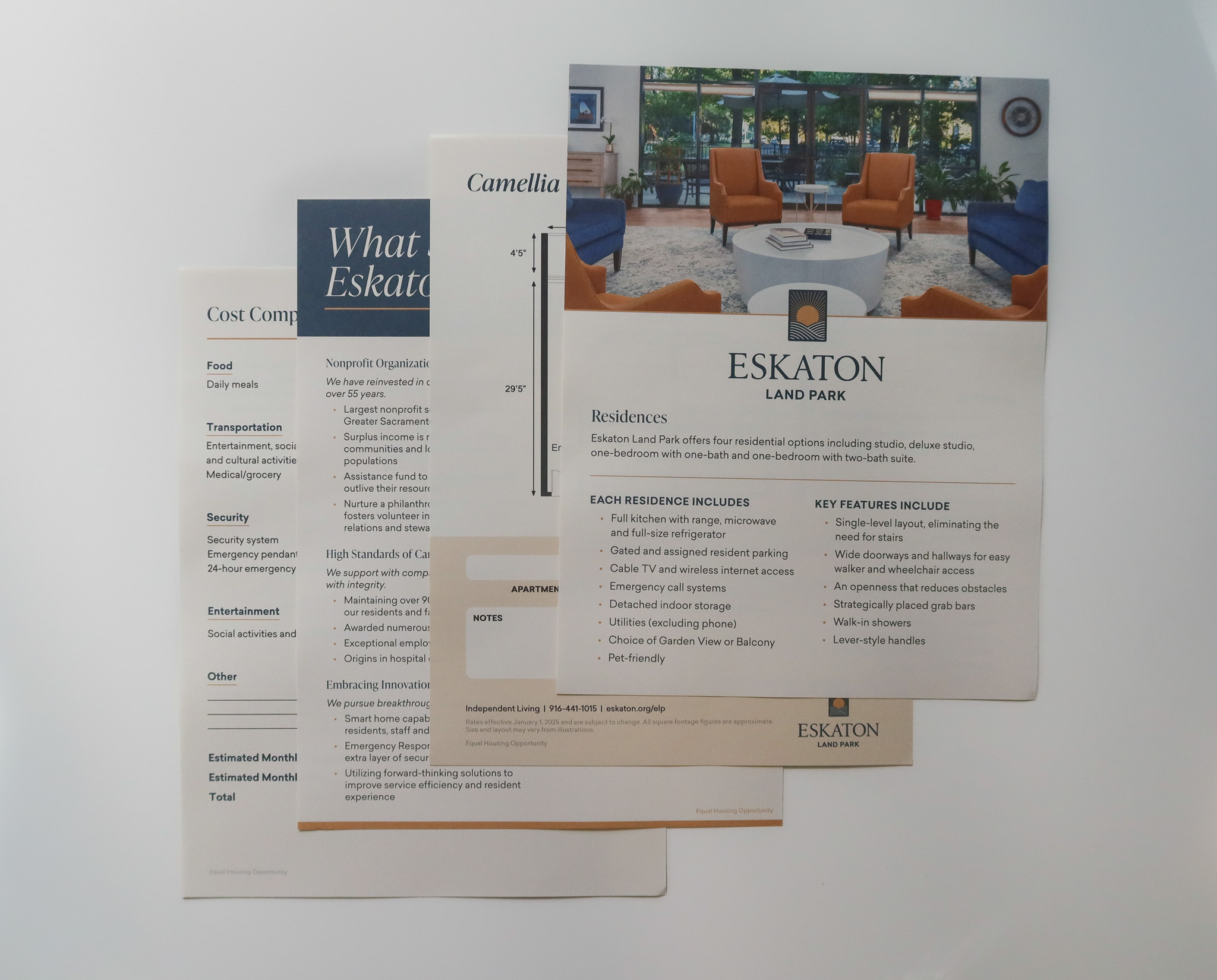
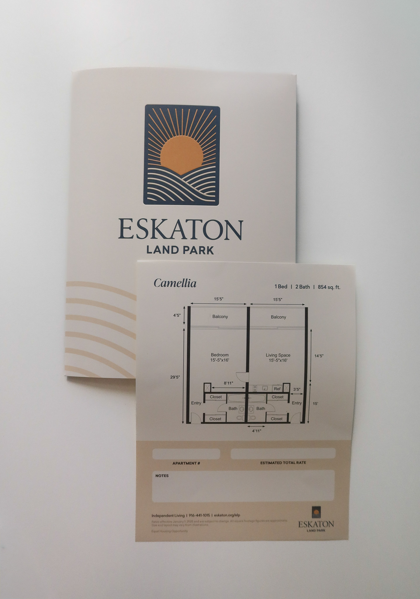
Dawning of a revitalized brand.
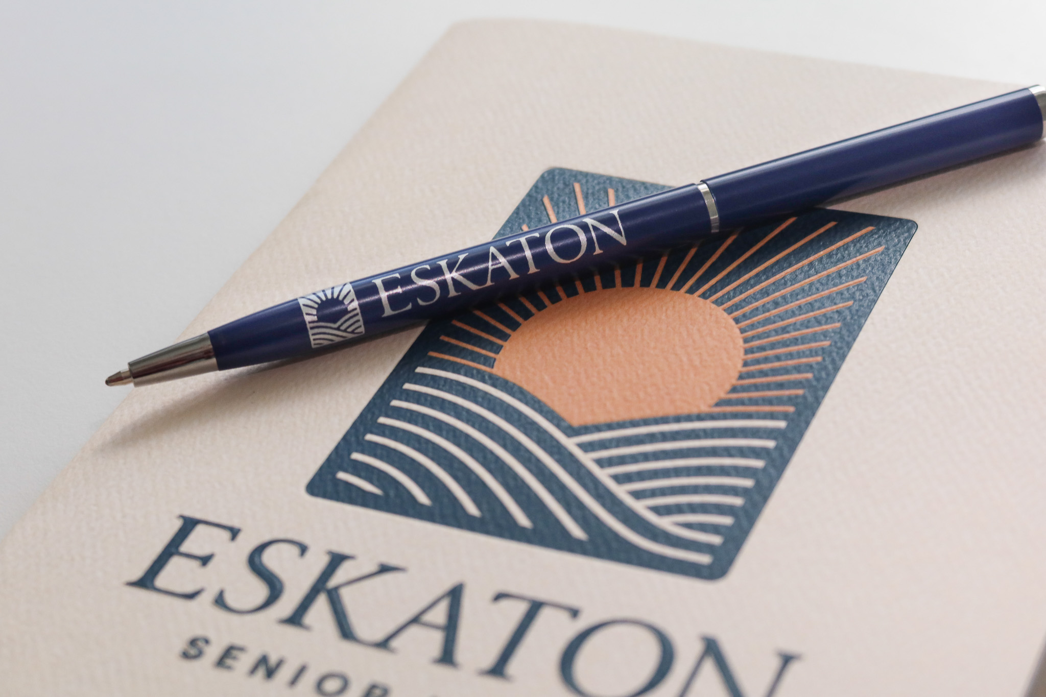
The Communications team and I collaborated with Wallop, a branding agency, to develop a new logo for Eskaton.
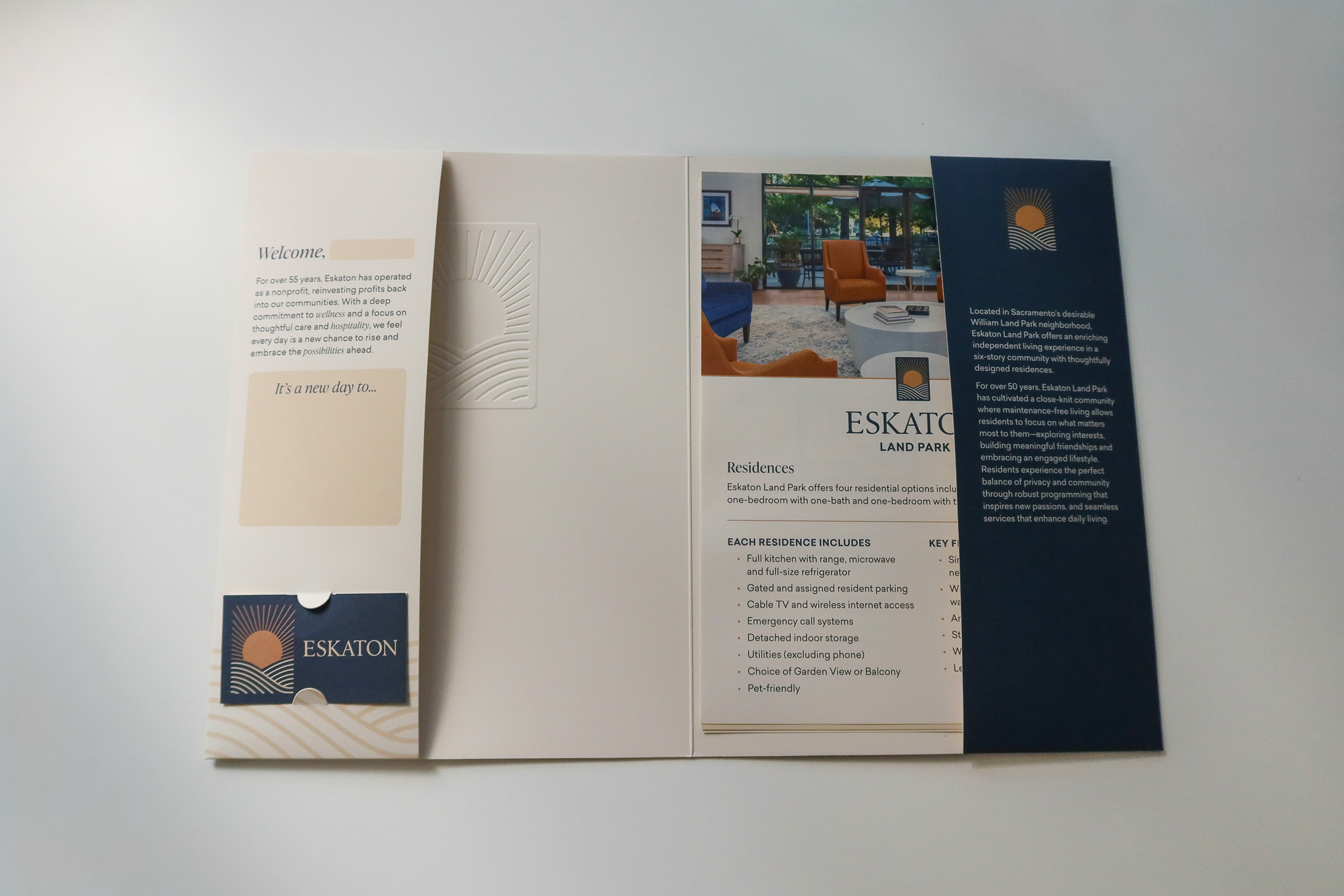
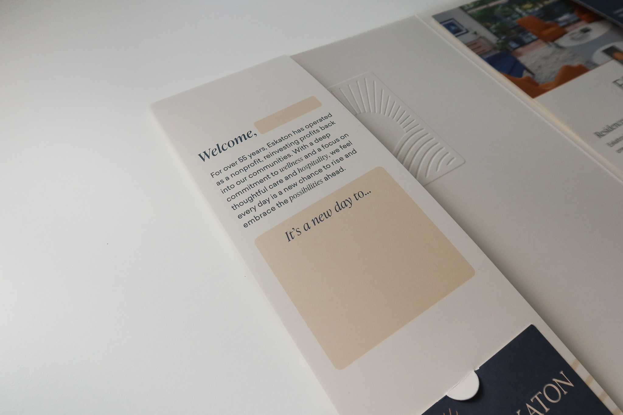
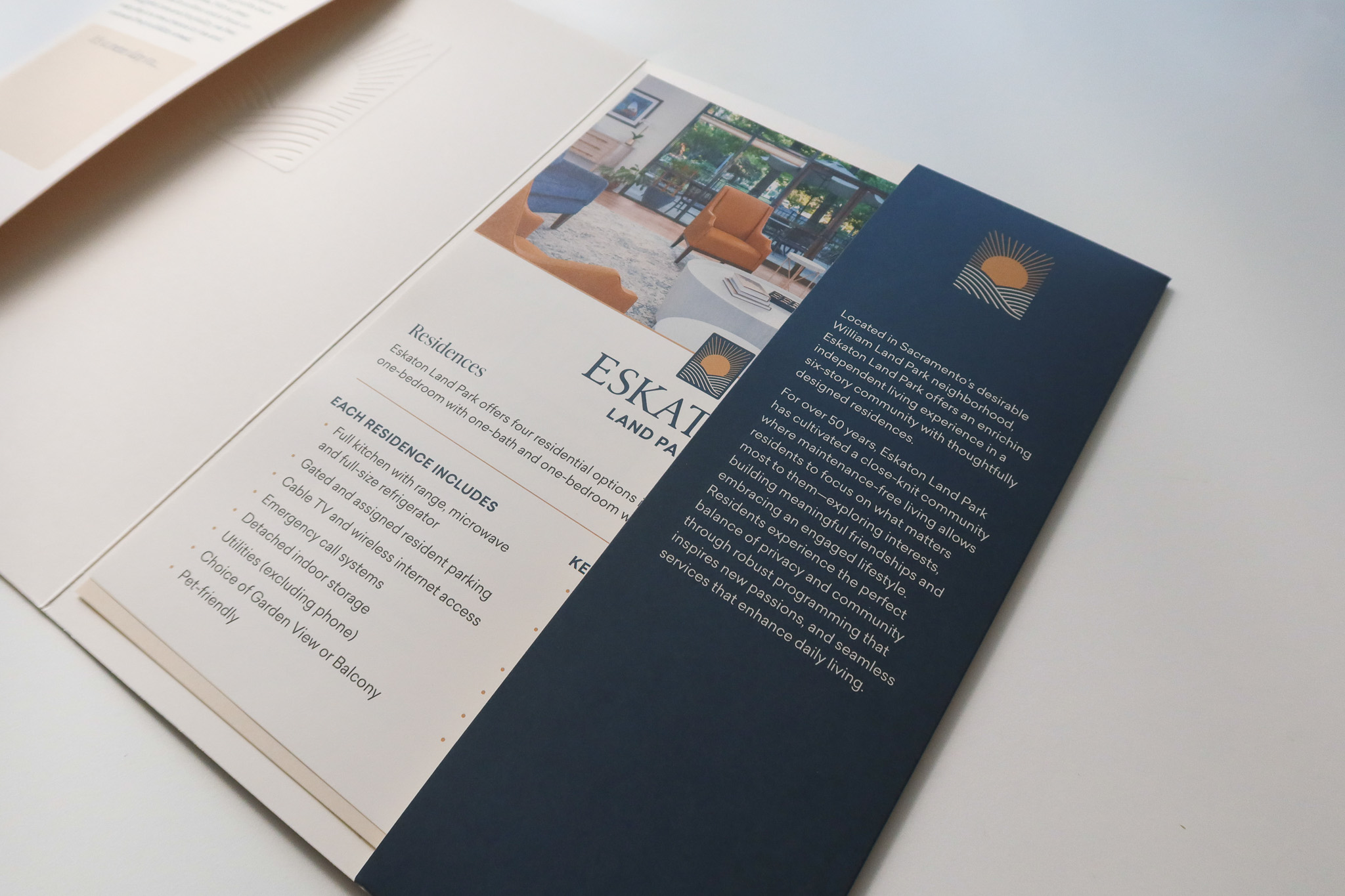
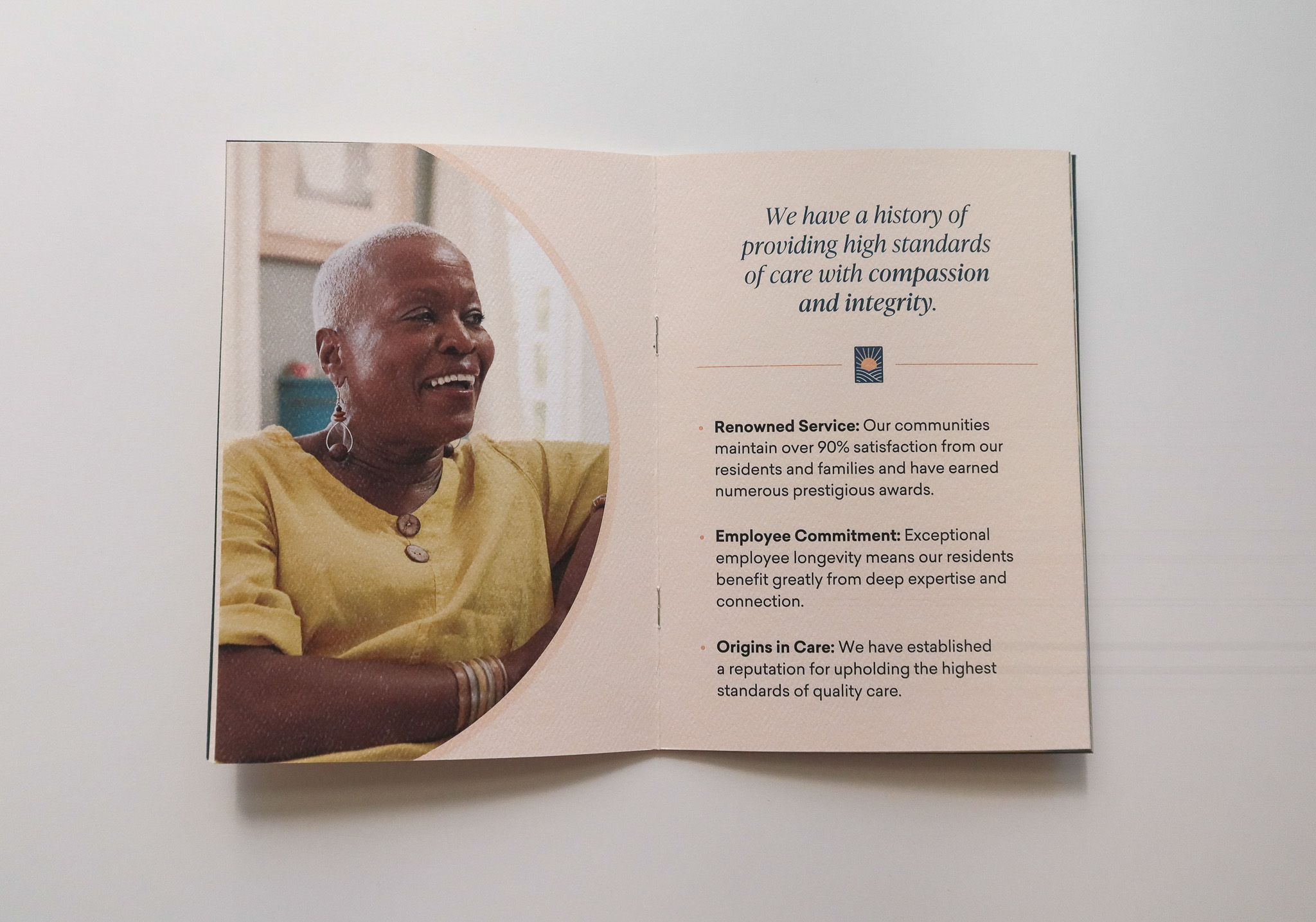
Once we had the logo established, I worked on a building scalable visual identity, that clearly distinguished itself from the previous clinical aesthetic. In generating design concepts, my primary focus was to capture the essence of Eskaton communities as places where residents forge meaningful connections, experience a true sense of belonging and reflect the organization's humble nonprofit foundation.